

Displaying Trendlines in Excel Charts
by Avantix Learning Team | Updated February 18, 2021
Applies to: Microsoft® Excel® 2010, 2013, 2016, 2019 and 365 (Windows)
In Microsoft Excel, you have the ability to add one or more trendlines to a chart and to project future results. This article is the second in a series of simple ways to show trends in your Excel data.
Recommended articles: Simple Strategies to Show Trends in Excel (Part 1) and (Part 3)
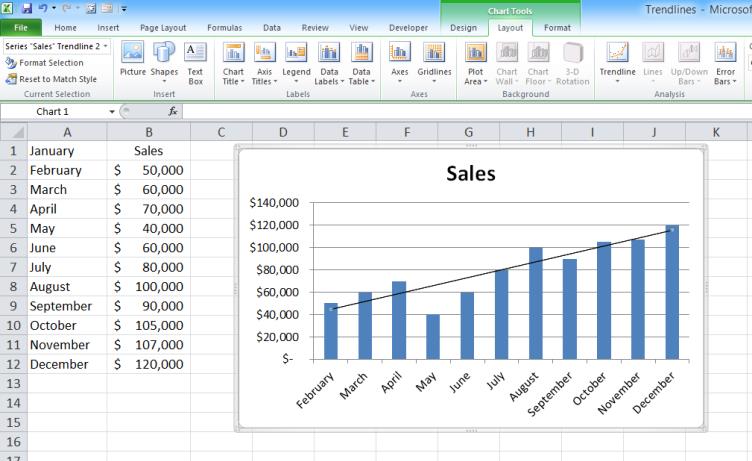
Creating a chart in Excel
The first thing you will need to do is enter enough data in a worksheet with consistent intervals (i.e. weekly, monthly or yearly) to display a trend.
To create a chart:
- Select the data you wish to chart.
- Click the Insert tab in the Ribbon.
- In the Charts group, click the Chart type you would like to create and choose a chart type from the drop-down list. An embedded chart will be added to the sheet.
- Click the chart. Note the Chart Tools tabs that now appear in the Ribbon. Use the tabs to format the chart or change the chart type.
- If there is only one data series, you can remove the legend by clicking its edge and pressing Delete.

Adding a trendline to a chart
To add a trendline:
- Click the chart.
- Select the data series where you wish to display a trendline (usually this involves clicking a column to select the column series or on a line to select a line series).
- Click the Chart Tools Layout tab.
- In the Analysis group, click Trendline. A drop-down menu appears.
- Choose the desired type of trendline or click More Trendline Options for other choices, make a choice and click Close. A trendline appears.

Types of trendlines
There are a several different types of trendlines:
- Use a linear trendline for simple data. If your data works best with a straight line, use a linear trendline which represents a steady rate of increase or decrease.
- Use a logarithmic trendline for data that starts with a sharp change and levels out.
- Use a moving average trendline for rapidly fluctuating data such as stock prices. This type of trendline smooths out the fluctuations to show the overall trend.
- Use a polynomial trendline for gradually fluctuating data. Whereas a moving average trendline suppresses individual fluctuations, a polynomial trendline makes them stand out.
- Use a power trendline when working with measurements that increase at specific rates (such as truck accelerations) and all data values are greater than zero.
- Use an exponential trendline for data that rises or falls at rates that increase constantly.
Formatting trendlines
To format a trendline:
- Click the trendline.
- Right-click it and choose Format Trendline.
- Choose the desired options.
- Click Close.

Displaying the R-squared value
You can display the R-squared value which indicates how closely your trendline follows your data. The closer the value is to 1, the closer it follows your data. Select the R-squared value check box in the Format Trendline dialog box.
You can move the R-squared value to another location on the chart by clicking on it to display sizing handles. Point to one of the handles and drag with the left mouse button to a new location.
Projecting a trend
You can project a trend forward, backward or both.
To add a forward projection to a trendline:
- Click the trendline.
- Right-click and choose Format Trendline.
- Enter a number in the Forward field of the Forecast section to project a trend forward.
- Click Close.


Trendlines are simple to add to your charts to show trends in Excel.
Subscribe to get more articles like this one
Did you find this article helpful? If you would like to receive new articles, join our email list.
Related articles
How to Fill Blank Cells in Excel with a Value from a Cell Above
How to Use Flash Fill in Excel to Clean or Extract Data (Beginner's Guide)
How to Quickly Delete Blank Rows in Excel
Related courses
Microsoft Excel: Intermediate / Advanced
Microsoft Excel: Data Analysis with Functions, Dashboards and What-If Analysis Tools
Microsoft Excel: Visual Basic for Applications (VBA) | Introduction
Our instructor-led courses are delivered in virtual classroom format or at our downtown Toronto location at 18 King Street East, Suite 1400, Toronto, Ontario, Canada (some in-person classroom courses may also be delivered at an alternate downtown Toronto location). Contact us at info@avantixlearning.ca if you'd like to arrange custom instructor-led virtual classroom or onsite training on a date that's convenient for you.
Copyright 2024 Avantix® Learning
You may also like
How to Replace Zeros (0) with Blanks in Excel
There are several strategies to replace zero values (0) with blanks in Excel. If you want to replace zero values in cells with blanks, you can use the Replace command or write a formula to return blanks. However, if you simply want to display blanks instead of zeros, you have two formatting options – create a custom number format or a conditional format.

What is Power Query in Excel?
Power Query in Excel is a powerful data transformation tool that allows you to import data from many different sources and then extract, clean, and transform the data. You will then be able to load the data into Excel or Power BI and perform further data analysis. With Power Query (also known as Get & Transform), you can set up a query once and then refresh it when new data is added. Power Query can import and clean millions of rows of data.
How to Freeze Rows in Excel (One or Multiple Rows)
You can freeze one or more rows in an Excel worksheet using the Freeze Panes command. If you freeze rows containing headings, the headings will appear when you scroll down. You can freeze columns as well so when you scroll to the right columns will be frozen.
Microsoft, the Microsoft logo, Microsoft Office and related Microsoft applications and logos are registered trademarks of Microsoft Corporation in Canada, US and other countries. All other trademarks are the property of the registered owners.
Avantix Learning |18 King Street East, Suite 1400, Toronto, Ontario, Canada M5C 1C4 | Contact us at info@avantixlearning.ca