Microsoft Excel: Data Visualization Techniques
Microsoft Excel Training Series | Level 3
Course Details
Duration: 1 day (9 am – 4 pm)
Microsoft® Excel® Versions: 2019, 2021 or 365 (Windows)
Delivery Methods (Instructor-led): In-person (Live classroom) | Online in virtual classroom
Course Dates: Check back soon for new dates (Online in virtual classroom or In-person) | View schedule ![]()
Course Fee: $295 CAD per person + HST (Virtual classroom), $325 CAD per person + HST (Bring your own device for in-person courses) or $345 CAD per person + HST (Avantix Learning provides device for in-person courses)*
Timing: Public scheduled courses run from 9:00 am to 4:00 pm (Eastern Time).
Virtual classroom courses: Our instructor-led virtual classroom courses are delivered in a virtual classroom environment. Students will be sent a virtual classroom invitation prior to the course.
In-person classroom courses: Our instructor-led, live classroom (in-person) courses are held in downtown Toronto at 18 King Street East, Suite 1400, Toronto, Ontario, Canada. Some courses are also held at an alternate downtown Toronto location.
Custom training: This course may be delivered at your site or ours as an instructor-led virtual classroom or in-person solution. Contact us at info@avantixlearning.ca for more information including savings for custom group training.
Some public courses and / or formats and may be subject to a minimum enrollment requirement.
![]()
Course Overview
This instructor-led Excel course is designed for the user who wants to take advantage of the advanced charting capabilities in Excel. Students will learn to generate charts from different types of data. Advanced charts will be created including interactive charts that change if you click a button or checkbox. A variety of newer charts available in Excel will be created using different strategies including map charts. Throughout this course, the instructor will include numerous tips, tricks and shortcuts.
Note: Some features are available only in Excel 2021 and 365 (such as dynamic arrays).
Prerequisite: Microsoft Excel: Intermediate / Advanced or equivalent knowledge and skills.
Location and timing: Public scheduled courses are held online in virtual classroom format or in downtown Toronto and run from 9:00 am to 4:00 pm (Eastern Time).
Related training: View all Microsoft Excel courses >
INCLUDED IN THIS COURSE
- Full course manual
- Keyboard shortcuts quick reference
- Sample and exercise files
- Refreshments (for classes conducted in Avantix Learning classrooms)
- Certificate of completion
- Follow-up email support
Course Topics
Using Themes
- Creating and applying themes to format charts consistently
Generating Charts from Data
- Selecting different types of source data
- Inserting embedded charts or charts sheets
- Moving charts to a worksheet or a chart sheet
- Generating charts with keyboard shortcuts
- Selecting a chart type
- Changing the chart type
- Using recommended chart types
- Adding alternative text to charts
Working with Source Data
- Editing source data
- Adding new data to the source
- Creating dynamic data sources
Applying Formatting to Charts
- Selecting elements in a chart
- Adding elements to a chart
- Applying chart styles and styles
- Resetting a chart
- Adding a trend line to a chart
Saving Time with Chart Templates
- Saving custom chart templates
- Applying a custom chart template
Using Newer Chart Types
- Creating Treemap charts
- Inserting Sunburst charts
- Generating Waterfall charts
- Creating Histogram charts
- Designing Pareto charts
- Inserting Box and Whisker charts
Creating Interactive Charts
- Adding buttons, checkboxes and scrolling menus to make charts interactive
- Creating charts from dynamic arrays (available in specific Excel versions)
Creating Power Maps or Map Charts
- Creating map charts using Power Maps to visualize data on geographical maps
Creating Timelines
- Presenting timelines with timeline charts
Inserting Charts in Word or PowerPoint
- Copying a chart to Word or PowerPoint
- Linking to Excel charts in Word or PowerPoint
Our instructor-led courses are delivered in virtual classroom format or at our downtown Toronto location at 18 King Street East, Suite 1400, Toronto, Ontario, Canada (some in-person classroom courses may also be delivered at an alternate downtown Toronto location). Contact us at info@avantixlearning.ca if you'd like to arrange custom instructor-led virtual classroom or onsite training on a date that's convenient for you.
Copyright 2025 Avantix® Learning

Custom training (Onsite or Online in Virtual Classroom)
Register now for a public course or contact us at info@avantixlearning.ca for more information about any of our courses or to discuss custom training options (virtual classroom or in-person in live classroom).
Related courses
Microsoft Excel: Intermediate / Advanced
Microsoft Excel: Data Analysis with Functions, Dashboards and What-If Analysis Tools
Microsoft Excel: Introduction to Power Query (Get and Transform Data)
Microsoft Excel: Introduction to Power Pivot and Data Models
Microsoft Excel: Introduction to Dynamic Arrays
Microsoft Excel: Visual Basic for Applications (VBA) Macros | Introduction
You may like
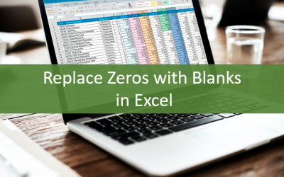
How to Replace Zeros (0) with Blanks in Excel
There are several strategies to replace zero values (0) with blanks in Excel. If you want to replace zero values in cells with blanks, you can use the Replace command or write a formula to return blanks. However, if you simply want to display blanks instead of zeros, you have two formatting options – create a custom number format or a conditional format.

What is Power Query in Excel?
Power Query in Excel is a powerful data transformation tool that allows you to import data from many different sources and then extract, clean, and transform the data. You will then be able to load the data into Excel or Power BI and perform further data analysis. With Power Query (also known as Get & Transform), you can set up a query once and then refresh it when new data is added. Power Query can import and clean millions of rows of data.
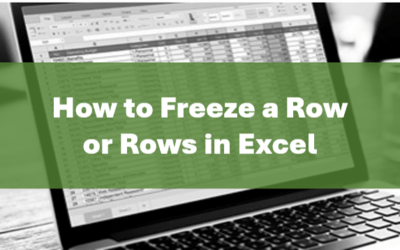
How to Freeze Rows in Excel (One or Multiple Rows)
You can freeze one or more rows in an Excel worksheet using the Freeze Panes command. If you freeze rows containing headings, the headings will appear when you scroll down. You can freeze columns as well so when you scroll to the right columns will be frozen.

How to Show or Hide Gridlines in Excel
You can remove or hide gridlines in Excel worksheets to simplify worksheet design. By default, gridlines are displayed but do not print. Gridlines are applied to entire worksheets or workbooks, not to specific cells. If you hide gridlines on one worksheet, it doesn't affect other sheets in the same workbook.

How to Combine First and Last Name in Excel (5 Ways)
You can combine first and last name in Excel in several ways – using the CONCATENATE operator, the CONCATENATE function, the CONCAT function, the TEXTJOIN function or Flash Fill. These functions are often used to combine text in cells but you can also combine text with spaces, commas, dashes or another character. It's common to combine first and last names that appear in two columns into one new column. Some functions are only available in newer versions of Excel but the CONCATENATE operator and function are available in all versions.
You may also like

How to Cut, Copy and Paste Text in Word (5 Ways with Shortcuts)
In this guide, we'll cover 5 ways to cut, copy and paste text in Microsoft Word. A common method is to use keyboard shortcuts but you can also use the Ribbon, the context menu and a few hidden tools as well. After you paste your text, you can choose paste options such as Keep Text Only.

How to Insert or Type an Upside Down Exclamation Mark in Word (5 Ways to Insert ¡ with Shortcuts)
This guide covers five easy ways to insert or type the upside down exclamation mark (¡) in Microsoft Word including shortcuts, Alt codes and custom key combinations. The upside down exclamation mark or inverted exclamation mark is used in the Spanish language at the beginning of exclamatory sentences and helps readers understand tone before completing the sentence.
How to Insert and Format Icons in PowerPoint
You can curve text in PowerPoint using WordArt Transform options on the Shape tab in the Ribbon. The text can be WordArt text or text in a text box or in a placeholder. Using Transform text effects, you can curve or bend selected text. The text can be curved around a circle or other shape if you want. Typically, curved text is inserted in Normal View and can be a word or a line of text.
Image credit(s) / application screenshot(s): Microsoft
Microsoft, the Microsoft logo, Microsoft Office and related Microsoft applications and logos are registered trademarks of Microsoft Corporation in Canada, US and other countries. All other trademarks are the property of the registered owners.
Avantix Learning |18 King Street East, Suite 1400, Toronto, Ontario, Canada M5C 1C4 | Contact us at info@avantixlearning.ca