
Use Excel Sparklines to Display Trends Visually
by Avantix Learning Team | Updated January 7, 2020
Applies to: Microsoft® Excel® 2010, 2013, 2016, 2019 and 365 (Windows)
This article is the first in a series of simple ways to show trends in your Excel data. In Excel 2010 and later versions, you can use Sparklines to display trends in your data visually on the worksheet. Sparklines are miniature charts that you can display in cells, usually immediately to the right of the data you wish to summarize.
Recommended articles: Simple Strategies to Show Trends in Excel (Part 2) and (Part 3)
Inserting Sparklines in
To insert a Sparkline:
- Set up a worksheet with a least 3 columns of data. The data should be adjacent to each other (no blank columns or rows) and be the same size (in terms of the height of the range).
- Select the cells where you wish to display Sparklines. The cells should be in one column and are usually immediately to the right of the data you wish to summarize. Be sure to select the same size (height) as the source data.
- Click the Insert tab in the Ribbon.
- In the Sparkline group, click the Line button. A dialog box appears.
- Click in the Data Range box and select or enter the range of data you wish to summarize. The range you originally selected should appear in the Location Range.
- Click OK or press Enter.

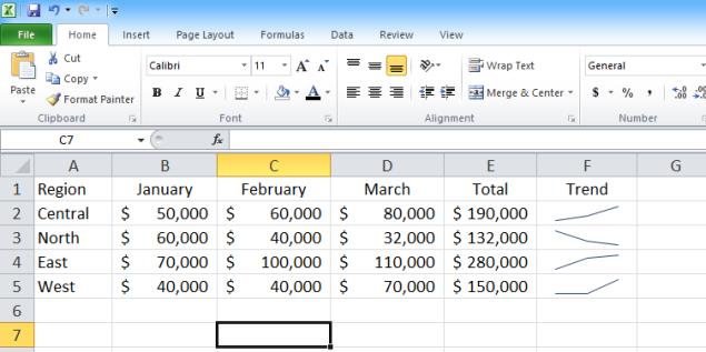
Let's try an example. In the following worksheet, data has been entered in cells B2 to D5.
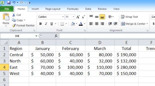
I would like to create Sparklines in cells F2 to F5 (note that the height of the ranges are consistent).
To create Sparklines:
- Select cells F2 to F5.
- Click the Insert tab in the Ribbon.
- In the Sparkline group, click the Line button. A dialog box appears.
- Click in the Data Range box and select or enter the range of data you wish to summarize (B2:D5). The range you originally selected should appear in the Location Range.
- Click OK or press Enter.
Formatting Sparklines
To format Sparklines:
- Click in any cell with a Sparkline (the entire range should appear with a blue border).
- Click the Sparkline Tools Design tab.
- Select the formatting element you want to change. You can highlight data points such as high, low or negative, choose a color scheme, select line and marker colors or change the type of Sparkline.
Clearing Sparklines
To clear Sparklines:
- Click in any cell with a Sparkline (the entire range should appear with a blue border).
- Click the Sparkline Tools Design tab.
- Click the Clear drop-down menu.
- Choose Clear Selected Sparklines or Clear Selected Sparkline group.
Sparklines are easy to create and can provide a great visual representation of trends in your data.
Subscribe to get more articles like this one
Did you find this article helpful? If you would like to receive new articles, join our email list.
To request this page in an alternate format, contact us.
Related articles
How to Use Flash Fill in Excel to Clean or Extract Data (Beginner's Guide)
How to Quickly Fill in Missing Values from the Cell Above in Excel
10 Great Excel Navigation Shortcuts
Related courses
Microsoft Excel: Intermediate / Advanced
Microsoft Excel: Data Analysis using Functions, Dashboards and What-If Analysis Tools
Microsoft Excel: Visual Basic for Applications (VBA) | Introduction
Our instructor-led courses are delivered in virtual classroom format or at our downtown Toronto location at 18 King Street East, Suite 1400, Toronto, Ontario, Canada (some in-person classroom courses may also be delivered at an alternate downtown Toronto location). Contact us at info@avantixlearning.ca if you'd like to arrange custom instructor-led virtual classroom or onsite training on a date that's convenient for you.
Copyright 2024 Avantix® Learning
You may also like

How to Replace Zeros (0) with Blanks in Excel
There are several strategies to replace zero values (0) with blanks in Excel. If you want to replace zero values in cells with blanks, you can use the Replace command or write a formula to return blanks. However, if you simply want to display blanks instead of zeros, you have two formatting options – create a custom number format or a conditional format.

What is Power Query in Excel?
Power Query in Excel is a powerful data transformation tool that allows you to import data from many different sources and then extract, clean, and transform the data. You will then be able to load the data into Excel or Power BI and perform further data analysis. With Power Query (also known as Get & Transform), you can set up a query once and then refresh it when new data is added. Power Query can import and clean millions of rows of data.
How to Freeze Rows in Excel (One or Multiple Rows)
You can freeze one or more rows in an Excel worksheet using the Freeze Panes command. If you freeze rows containing headings, the headings will appear when you scroll down. You can freeze columns as well so when you scroll to the right columns will be frozen.
Microsoft, the Microsoft logo, Microsoft Office and related Microsoft applications and logos are registered trademarks of Microsoft Corporation in Canada, US and other countries. All other trademarks are the property of the registered owners.
Avantix Learning |18 King Street East, Suite 1400, Toronto, Ontario, Canada M5C 1C4 | Contact us at info@avantixlearning.ca